


As with all Frameworks, Svelte has it's own special way of handling CSS. While most of it will be completely straight forward, I figured it would be worth a look at how Svelte handles CSS. The better a developer understands the tools, the easier it is to debug and
Bundling
Please Note: If you are using Sapper, the bundling is different. But for our overview here, I'm going to leave out what Sapper does.
Svelte will take and combine all of the CSS from every component used and and merge it into a single file called bundle.css. Svelte will take as much whitespace out (space, tabs, enter) that can be done while still maintaining the CSS styling. Svelte will also check and if a CSS rule isn't used it won't be included.
This bundled file isn't very human friendly. You'll be scrolling to the right for a while. :) But it's much smaller for downloading, and the browser doesn't really care about whitespace anyway.
There is a second file created; bundle.css.map. This file contains the mapping information used by debuggers. If we look inside the browser dev tools we'll notice that the styles will be listed what line in the component files the style is from. Even though the files being used are bundled. It's all thanks to the map file. Scroll down to the first screen shot and look at numbers 6 and 7.
Component Level
As expected, inline styles works as ... well ... expected. They stay inline, on the HTML element. They will not be bundled. Svelte doesn't mess with them at all. Not much to say really. So we'll move on.
Inside each component can be a style tag. I say can, because it is optional. The placement is up to the developer. I prefer to place the style tag after the HTML section in a Svelte app. But if you are using a code formatter it may move the code to sit between the script and HTML. Since it doesn't matter to Svelte, I'd say the most important is to be consistent. It would be confusing to find some components with the style before the HTML and then some with the HTML before.
One of the advantages of Svelte is that the CSS is component-scoped. That means a CSS style changing the p tag to blue, will have no effect on p tags in other components. So how does it do that? The best is with an example.
If you want to follow along start up a new Svelte project and replace the App.svelte with the following:
<script>
    import NewComponent from './NewComponent.svelte';
</script>

<main>
    <h1>Hello!</h1>
    <p>Some text!</p>
    <NewComponent />
</main>

<style>
    main {
        text-align: center;
    }
    h1 {
        color: #ff3e00;
        text-transform: uppercase;
        font-size: 4em;
        font-weight: 100;
    }
</style>
Add a new component called NewComponent.svelte in the src folder and place this in the file.
<h1>Hi, from in the component.</h1>
<p class="myStyle">Some Other Text.</p>

<style>
    h1 {
        color: green;
    }
    .myStyle {
        font-style: italic;
    }
</style>
Because to view what is ending up in the browser, we need to explore the dev tools. Using the REPL on the Svelte page won't be as useful. The REPL itself has a lot of elements that we'd need to dig through to get to the elements we want.
Now, let's talk about the styling. You'll notice that both the components have a style rule for h1. So which will be applied? Well, both. It depends on where the h1 element is. The h1 style will be applied to the h1 element in it's own component. How is this done?
Here is the Svelte app listed above running with the dev tools open.
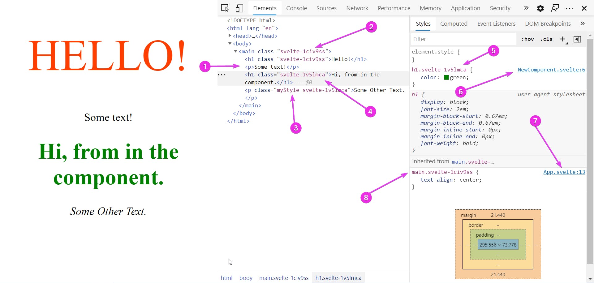
On the <main> (2) and the first <h1> there is a class svelte-1civ9ss applied. We didn't put it there, Svelte did. Let's take a look at what Svelte did. Inside the public/build folder we'll find the bundle.css file. Here I'll add a little spacing to make it a little easier to read.
main.svelte-1civ9ss {
  text-align: center;
}
h1.svelte-1civ9ss {
  color: #ff3e00;
  text-transform: uppercase;
  font-size: 4em;
  font-weight: 100;
}
h1.svelte-1v5lmca {
  color: green;
}
.myStyle.svelte-1v5lmca {
  font-style: italic;
}
Notice that every CSS rule has a class added to it. These are the same classes we saw added to the HTML above. The Class correspond to the component the HTML and CSS was in.
You may notice that the p (1) tag in App.svelte doesn't have a class added to it. That's because no styling is being applied to it.
How to add a class
Besides the obvious method of just typing in the class name. We may want to add the class dynamically.
<div class="primary" class:error={valid == true}>{message}</div>
The primary class will be added as expected. class: is a Svelte directive that will add the error class if valid is equal to true.
<div class:error={error}>{message}</div>
The error class will be added if the error variable is true. We're assuming that there is a variable in the JavaScript called error that is a boolean.
<div class="{error ? 'error' : ''}">{message}</div>
This is exactly the same as the one before. If the variable error is true the class error will be added.
<div class:error>{message}</div>
This is the shorthand. And still does the exact same thing. If the variable error is true the class error will be added.
Which style should you use? I think it depends on the variable and class name. I'd use whichever reads better. If you can make your code read like a proper sentence it'll make it much easier for someone else (or you in six months) to figure what you meant for the code to do.
Global Level
Having the CSS scope to a certain component is great since you don't need to worry about styles messing with elements it's not supposed to. But what happens if you want a style to apply to multiple components. Out of the box, Svelte gives you two options to use global styles.
For the first method; in the public folder there is a file called global.css this file is not bundled with the component level CSS. By inserting styles in the global.css file, no extra CSS classes will be added like at the component level. So a style selecting h1 will select all h1 elements no matter what component they are in.
CSS specificity still has power, so imagine putting a global style selected on an id, no matter how many CSS classes were placed on an element the id would still be applied. This is why it's so important to keep global styles in known locations. Trying to track these down can be a pain.
The advantage of using the global.css is that the name of the file tells you exactly what's in it. If you suspect a global style is making unwanted changes, you know where to look.
Pro-Tip:
Put CSS Variables in the global.css file so that they are accessed from any component. The advantage is that you now have a central location to control the colors and styles in your entire site.
The second method can be used in any component.
:global( someSelector ) {
    ...
}
Inside the parenthesis put a simple CSS selector and this will be bundled without the component's CSS class so it will apply globally. It would be exactly the same as putting it in the global.css file except it would be included in the component. This might be useful if you were doing a nav bar component that sat right at the top of the page and wanted to make sure that the body element had no margin. With a margin there would be space between the nav bar and the very top of the page. Not looking so good.
:global(body) {
    /* this will apply to <body> */
    margin: 0;
}

:global(.martha) {
    /* this will apply to all elements with the martha class */
    background-color: yellow;
}
What if you didn't want it to be completely global, but need to control the styles of child components?
There is a way. And it's still using the :global() directive. An example would be great. Let's make this our App.svelte read this:
<script>
    import NewComponent from './NewComponent.svelte';
</script>

<p>Hi!</p>
<NewComponent />
<div class="override">
    <NewComponent />
</div>

<style>
    p {
        color: orange;
    }
    .override :global(h1) {
        background-color: goldenrod;
    }
</style>
We're using same NewComponent component as above, twice, once it's inside a div with the class of override. I'm using that name to show I'm overriding the styles, but it could be any name. Or even just div instead of a class and it would work.
Please note that the :global() must be at the start of the selector or end but never the middle. This would not be allowed:
.override :global(h1) .title { // THIS WILL NOT WORK //
    background-color: goldenrod;
}
Looking into the dev tools, we can get an idea of how the styles have been applied.
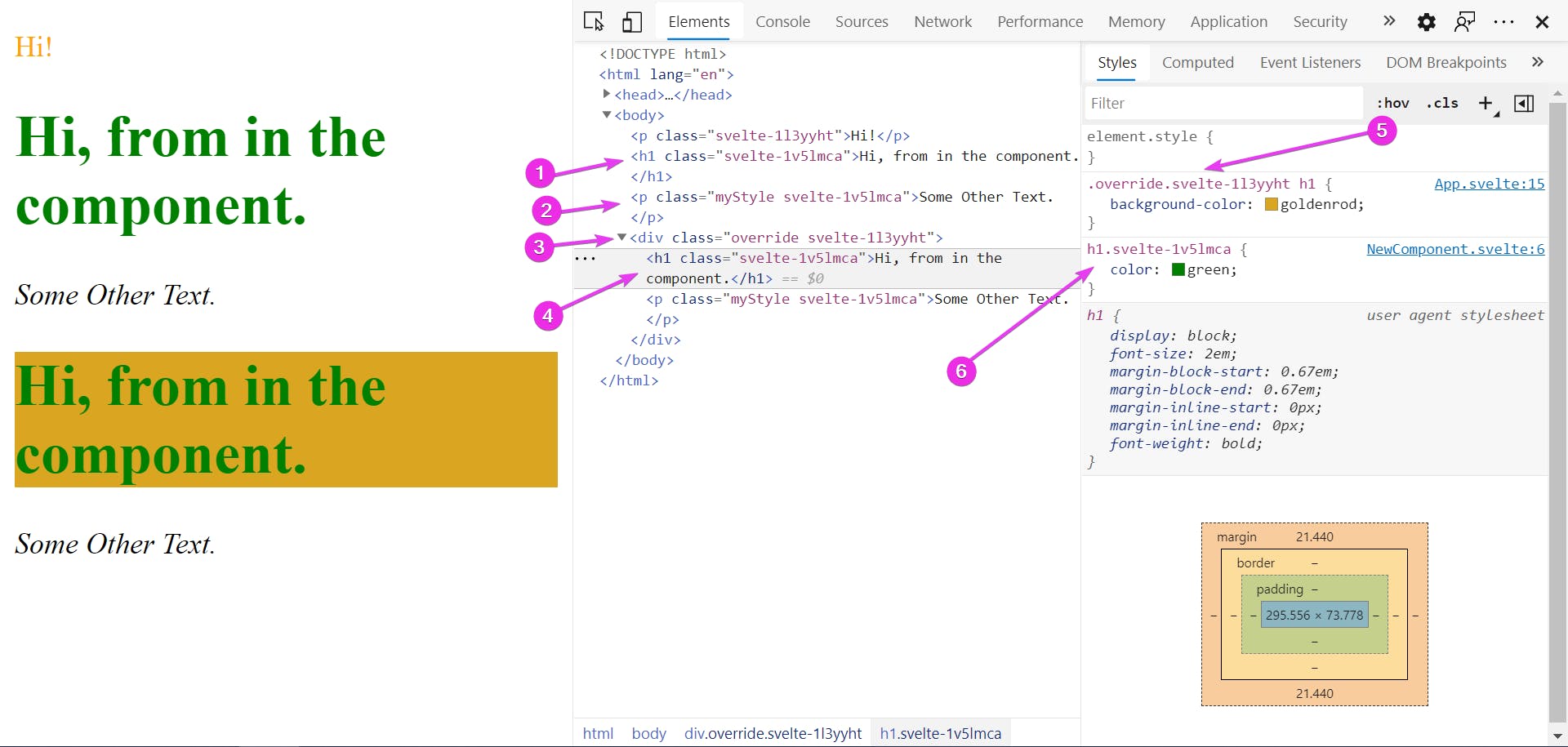
So what's the effect? The first time we use the component (1) & (2) it will be styled exactly as in the component. But the second time we use the component, the styles will be overridden (3) to the styles defined in the parent; the App.svelte component.
The second time we use that component, an .override class is applied (5) this is because it's (4) inside the div (3) from the parent component.
Special Note: when using the REPL at Svelte.com, (as well as other online editors) this will let you style elements such as the body element because most REPLs won't give you access to the global.css file.
CSS Preprocessor
A very common tool to use is a CSS Preprocessor. This is a tool that lets you write CSS with extra features and functions. For example some CSS Preprocessors let you create small CSS blocks very much like a function in JavaScript. Since browsers can't understand these extra features, a Preprocessor runs and compiles it into standard CSS that browsers can understand. Very much like Svelte does for JavaScript. There are many examples; SASS, Less, and Stylus are the major ones right now.
While Svelte does allow for the use of a CSS Preprocessor, to set it up is beyond the scope of this post. There are some changes to the development environment that needs to be handled. I'm working on a post on how to set up Sass and the Sass version of Bootstrap.
Bootstrap and other CSS Libraries
Bootstrap can be used without a Preprocessor. That's how most people use it. There is some extra power using the Sass version, but that's for another show.
So how can we use Bootstrap? The same way we normally use it. Inside the index.html file inside the src folder, we only need to add a link to the CSS library we want to use. It will be global just as global.css is. It won't be bundled with the other CSS that we write. But we'll be able to use it just as we would in any other project. This applies to any CSS library or Framework.
CSS-in-JS
Another option for handling CSS is using a JavaScript library that will add the CSS styles during run time. The advantage is that there is no CSS, it's all handled inside JavaScript. Svelte does support this.
Each CSS-in-JS library will be different. As a high level view, the process will be to import the js file that you have that has your rules for CSS-in-JS into the component. This JS file will in turn import the CSS-in-JS library itself.
In a way it takes away some of the advantages of Svelte. It's adding a JS library that needs to run when the site loads on the client browser. Also, Svelte can't shake out CSS that isn't being used. It's outside of Svelte's ability to streamline the whole process. But Svelte does give you the option to do it, so as a wise uncle once said "with great power comes great responsibilities"
Continuing
As mentioned I am working on a SCSS post. This will let you use SCSS in your Svelte app as well as use the SCSS version of Bootstrap.
For you, I'd suggest using a simple Svelte app, try out some IDs and classes. Try breaking the component-scope. Even great detectives like Sherlock Holmes did experiments to see what happens in certain situations. It's important to understand what happens when things are working correctly to best understand why something isn't.
Resources
Estelle Weyl does a wonderful job on specificity at www.standardista.com. She has a PDF that is a great cheat-sheet for what specificity is and how to calculate it.